
There’s no denying that video content is extremely popular, and it is only getting more so. As such, your website needs to start including video content to keep visitors happy. Luckily, WordPress has a great selection of responsive YouTube embed plugins.
One of the best options in WordPress would be the Simple YouTube Responsive plugin. It focuses entirely on displaying YouTube videos in WordPress and provides useful features like lazy loading, aspect ratio tuning, and more.
Today, I will demonstrate how to add a responsive YouTube embed with Simple YouTube Responsive.
Why Embed YouTube Content in WordPress?
Video content is insanely popular and there is no bigger platform than YouTube. It is the premier way for users to upload and store video content online and it is completely free to use.
Not to mention that it gets billions of views every month, which means your content is more likely to be viewed on YouTube.
This makes it very appealing because storing your own video content eats up a lot of resources. Thus, by choosing to embed your content instead of hosting it directly, you save site resources and improve performance.
Of course, this is just the technical reason. Video content also plays a major role in your website’s SEO. When users click play on a video, Google, and other search engines, see this as user engagement, which improves your rankings.
Not only this but watching a video keeps the users on your page longer, which can improve the bounce rate, which again, can improve your rankings. Simply put, choosing to embed YouTube content in WordPress is full of benefits to your site.
How to Embed YouTube Videos Responsively in WordPress
Step 1: Install Simple YouTube Responsive
As the name implies, this plugin is pretty simple to use. While it does have some useful features, there are not that many, thus setting it up is pretty straightforward.
It’s also worth pointing out that every iframe video in WordPress is responsive.
There is no extra work to make it responsive. As with all plugins, the first step is to install and activate it.
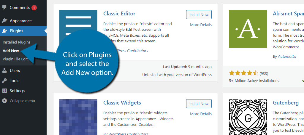
Let’s start by clicking on Plugins and selecting the Add New option on the left-hand admin panel.
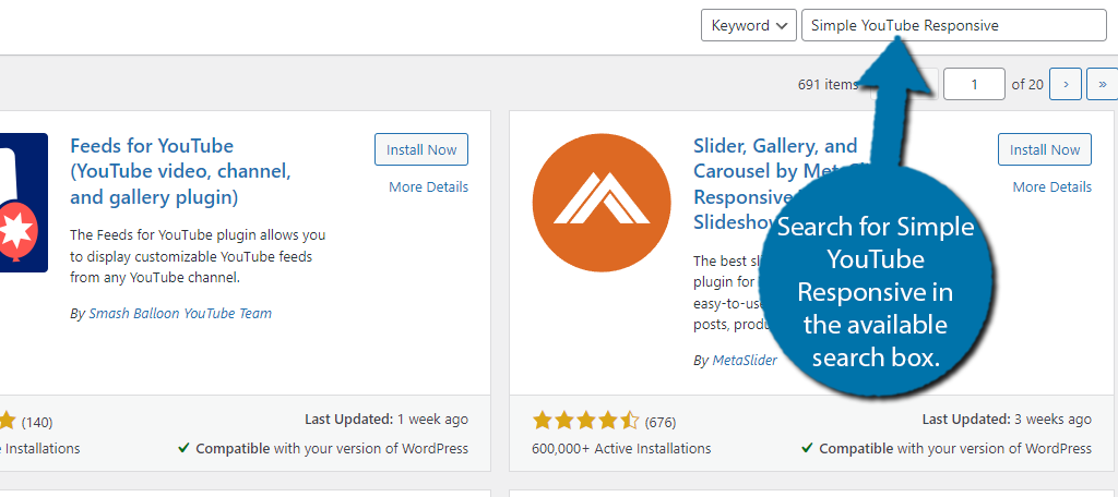
Search for Simple YouTube Responsive in the available search box. This will pull up additional plugins that you may find helpful.
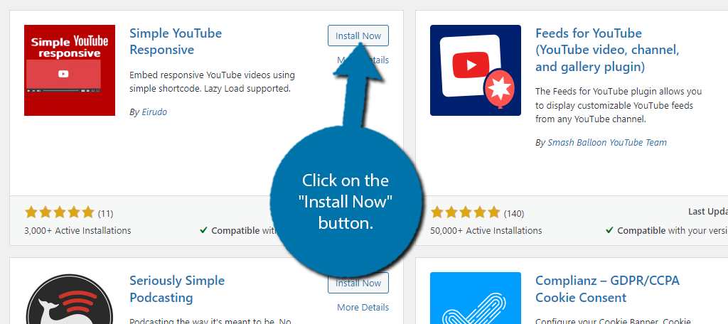
Scroll down until you find the Simple YouTube Responsive plugin and click on the “Install Now” button and activate the plugin for use.
Step 2: Configure the Settings
The Simple YouTube Responsive plugin does not have anything hard to set up. All of the settings are very simple and easy to understand and deal with things like video dimensions, video looping, autoplay, and so on.
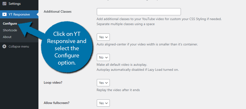
Most of this boils down to choosing an option from the drop-down menu. To find the settings, click on YT Responsive and select the Configure option.
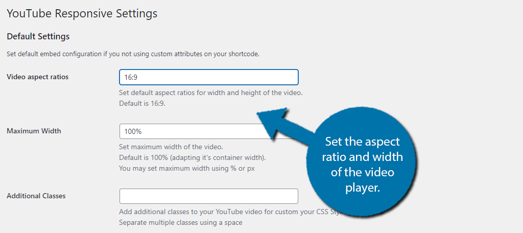
The first option is to assign the aspect ratio of the video. By default, you get the standard 16:9 ratio, but you can change it if needed.
Underneath this, you will also find an option for the video width. By default, you will see 100%. which is based on the video container.
You can also just delete this and enter the exact pixels you want for the width.
Below these options is the Additional Classes box. Here, you can enter custom CSS to customize the display of the video player to better match the design of your website.
You can also leave this blank to just get the default YouTube player.
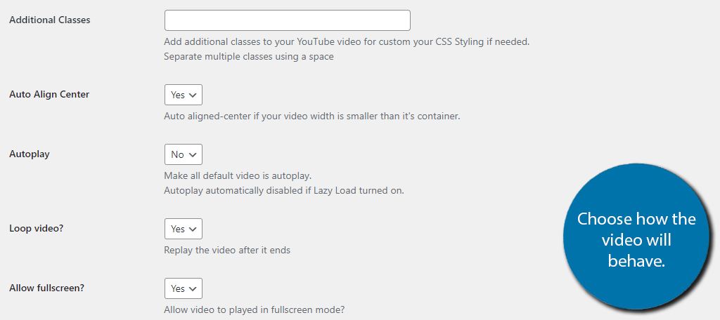
There is also an option to auto-align the video if you made the video width smaller than the video container below this.
The next three options all control how the video will behave starting with the Autoplay option. If this option is selected, the video will start playing the moment the page is loaded. Many users find this annoying, thus you probably want to turn it off.
Next is the option to loop a video. What this means is when the video ends, it will immediately begin again. This is a good option for shorter content that is under a minute, but not recommended for longer videos.
The last option is to give users the ability to toggle full screen on or off. Some websites avoid full-screen options because that means the user only sees the videos and none of the site content or advertisements.
I would keep it on for convenience, but the choice is yours.
The next section is about Lazy Loading. This is a powerful technique that works for media content like images and videos that simply loads the content when it is visible. This means allowing your page to load faster because it is not loading content the visitor cannot see.
This is particularly useful when you have a lot of images or videos on a single post or page. Simply select the Yes or No option and choose the thumbnail size for your videos.
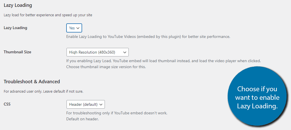
The last section is for advanced users that are using CSS and JS. Leave these as the default choices if you are not sure what the options actually mean.
Finally, click on the “Save Changes” button to finish.
Step 3: Embed Responsive YouTube Videos
All that’s left is to actually add the videos to WordPress. This plugin does this by utilizing shortcodes. All you would do is place the shortcode with the proper video ID, and that’s it.
There are several shortcodes and you can find a full list in the shortcodes section of the plugin.
First, let’s cover what a YouTube video ID is. To find it, go to the video you want to embed in WordPress and look at the URL. You should notice that it ends with something like: “v=“
What comes after that is your video ID.
Once you have this, all you need to do is add it to the shortcode. The default shortcode is:
[youtube v="XXXXX"]
In this case, the “XXXXX” is where you place the video ID. That’s really all there is to place a responsive YouTube video in WordPress.
Should Video Content Be the Main Content?
It’s no secret that the internet is changing. One of the biggest concerns is that video content will eventually become the normal way to consume content online, which will make written content like blogs or tutorials like this obsolete.
Instead, you will just click on the post and be greeted with a video player.
Clearly, this hasn’t happened yet, and honestly, it probably never will. Yet, that doesn’t mean some websites don’t already do this. The truth is video content is highly effective.
For example, on social media platforms, users retain 95% of the message from a video compared to just 10% from a written counterpart. That is a massive discrepancy. Not only this but being able to listen to content makes it more accessible.
How many times have you chosen to read a blog versus listening to a video on your phone? I’m willing to bet that most people would choose a video on their mobile device. Clearly, video content works as the main content on a website.
However, written content is still extremely efficient when it comes to SEO benefits. Thus, you should still include it. Even if it is just repeating the information in the video.
Embed A Responsive YouTube Video Today
As you can see, adding a responsive YouTube embed is pretty simple. And to be completely honest, you don’t even need a plugin to do it. Instead, you could just paste the video URL into a paragraph block and you have the full video ready to go.
This works very well and is naturally responsive. The reason you probably want a plugin is that you have more control over the size of the video, how it behaves, and can even style it with custom CSS to match your website.
In any case, it is easy to make YouTube iframe responsive in WordPress and you have a ton of options to choose from.
Do you have more video content than written content? Do you find users engage more with video content than written content?